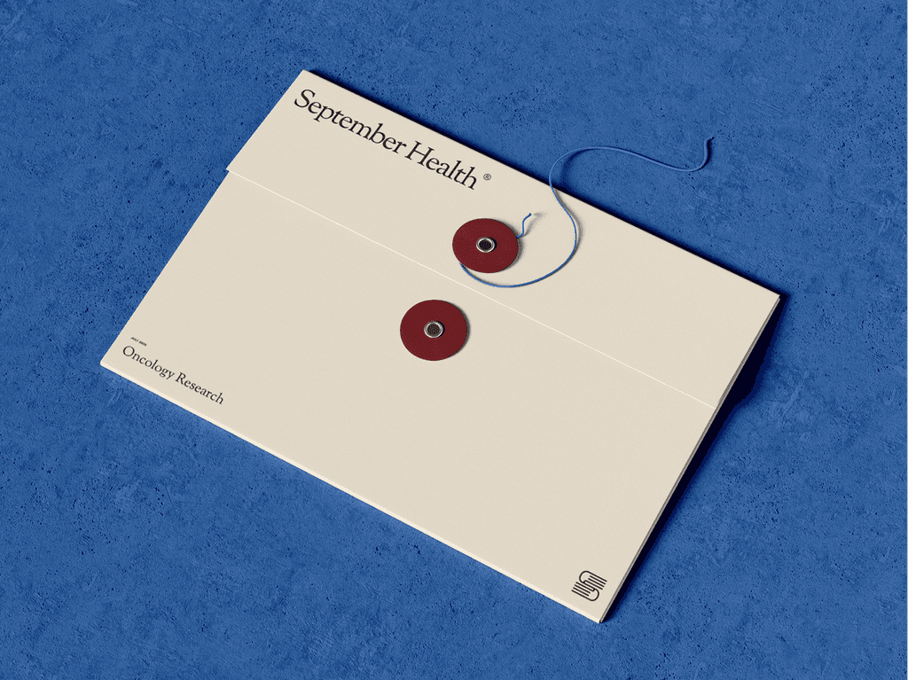
September Health came to us through a referral, looking for a brand that could hold credibility in healthcare without feeling cold or clinical. We started with strategy: mapping the competitive landscape, testing positioning hypotheses, and defining a brand architecture that lets September Health act as a quiet, trusted parent to the products it supports. That groundwork shaped every visual decision that followed.
The identity pairs a classic serif (Sorts Mill Goudy) with a clean, modern sans (Work Sans), balancing warmth and authority. A palette of Burgundy, Parchment, Ink, and Sage gives the brand an editorial, almost apothecary feel, grounded and calm rather than sterile. We designed the logo and a standalone S mark, explored it across mockups, and documented the full system in a brand guide covering voice principles, typography, color, and usage so the team can apply it consistently.
Category:
Healthcare
Duration:
6 Weeks
Location:
Bozeman, MT
Services:
Strategy + Branding, Web Design